Why a Public Square Needs More Than Open Ground
Why a public square needs more than open ground: compare edges, routes, and pause points to choose a layout that fits how people use the place.
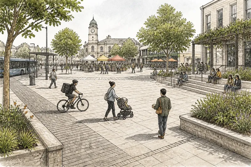
A delivery cyclist cuts across the plaza while a parent steers a stroller around a cluster of benches, and someone carrying lunch scans the bare paving for a place to sit. The scene makes the design question plain: a public square needs more than open ground. Its edges, routes, and places to pause tell people what they can do there—and whether they seem welcome to do it.
There is no single best arrangement. A square outside a transit stop has different demands from one beside a library or a neighborhood market. Comparing a clear central floor, a shaped perimeter, and a network of routes and pause points helps residents and designers choose a mix suited to the setting rather than copy a familiar template.
Open ground gives gatherings room to change
A broad, unobstructed center can host activities that are difficult to predict in advance: a neighborhood gathering, a small performance, a seasonal market, or simply a crowd waiting for a bus. Keeping the middle relatively clear leaves room for different groups to share it without a permanent structure deciding the square’s main purpose.
This approach often suits civic spaces where occasional gatherings matter, or where the surrounding buildings already provide activity and shade. It can also help a square feel visually legible from its entrances. A visitor can see across the space and choose a direction without having to decode a maze of objects.
But openness does not automatically invite use. A person who wants to eat lunch, wait for a friend, or watch children play may find a large empty surface exposed and awkward. If the only comfortable seats sit at the far edge, the center can look less like shared ground and more like a stage that ordinary visitors are expected to cross quickly.
There is a practical distinction between keeping a central area flexible and leaving the entire square without cues. A tree, a low seat wall, or a drinking fountain near the perimeter can give people a reason to stay while preserving a clear area for events. The useful question is not whether the center should be empty, but which parts need to stay adaptable and which everyday needs deserve a dependable place.
Shaped edges make staying feel ordinary
Edges can turn a square from a passage into a place to linger. A low wall beside a planting bed offers an informal seat; a row of movable chairs lets visitors face one another or turn toward a performance; a covered arcade gives people shelter near an entrance. These features help establish comfortable ways to occupy the square without requiring a scheduled event.
This option may suit a neighborhood square used throughout the day, especially where people arrive in small groups or alone. It gives visitors a choice of how close to sit to activity. Someone can watch a busy path from a seat at the edge, while friends can gather around a table without claiming the whole central area.
Edges also communicate boundaries. A raised planter may discourage shortcuts through a garden, while a broad step can suggest that sitting is welcome. A tall fence, narrow gate, or row of barriers can instead make a public place feel controlled, even if it is technically open. The materials and proportions matter, but so does the way they meet the street: an edge with several visible entrances reads differently from one with a single guarded opening.
Comfort depends on more than seating. Shade, wind exposure, views, and access to nearby activity shape whether a particular edge works for different visitors. A bench facing a blank wall may be useful for a short wait, but less appealing for a long visit. Movable chairs offer flexibility, although they need a place to be stored or managed when the square is cleared for another use.
Too much perimeter activity can crowd the center or make the square feel divided into private-feeling pockets. A café terrace, planting, and fixed furniture may each be reasonable on their own, yet together leave little room for people who arrive without a purchase or an organized group. The goal is not to furnish every edge. It is to provide enough inviting options that staying does not depend on having a particular reason or spending money.
Routes help people cross without displacing those who pause
A square often serves as part of a journey. People walk through it to reach a station, school, shop, or civic building, while others come specifically to sit or meet. A route-led layout makes those movements easier to read by giving through-walkers a clear path and keeping slow activities from spilling into the busiest line of travel.
This approach can suit a square near transit, a busy corner, or several destinations that draw people in different directions. Paths need not be fenced corridors. Changes in paving, a line of trees, or the placement of lights can make a route apparent while leaving room to step aside, meet someone, or choose another way across.
The challenge is to avoid treating every person who pauses as an obstruction. If the most direct route cuts between benches and a play area, passersby and seated visitors may compete for the same strip of space. If paths are too rigid, the square can feel like a junction with decoration rather than a place to spend time.
A useful layout lets a newcomer understand the main directions at a glance, while also making detours comfortable. For example, a path from the bus stop to the library entrance might run beside, rather than through, a small seating area. People in a hurry can continue without weaving through a gathering, and someone waiting can still see the approach to the entrance.
Say a neighborhood is reconsidering a paved square used by school families in the afternoon and market visitors on weekends. The design team could keep a clear central patch for market stalls, add a shaded sitting edge near the library, and mark a direct crossing between the bus stop and the main street with contrasting paving. The expected observable result would be that visitors can identify where to cross, where to wait, and where a temporary market might fit, while still moving between those uses without a forced route.
Choose the mix by watching what the setting asks for
Choosing among open ground, shaped edges, and defined routes is not a vote for one universal layout. Begin with the square’s actual surroundings: where people arrive from, what destinations they seek, when the space is busy, and what kinds of visits are already happening. A site plan can show entrances and buildings, but walking the area at different times can reveal where people naturally slow down, avoid a crossing, or gather out of the way.
Then consider who may be missing from the current pattern. A square that looks active at lunchtime may still offer little shelter for a caregiver waiting with a child, or no comfortable place for someone who cannot stand for long. The aim is not to assign every group a separate zone. It is to make choices available without forcing visitors to explain why they are there.
- Favor a clear center when the square needs to accommodate changing gatherings or temporary activities, and make sure the perimeter still offers reasons to stay.
- Invest in welcoming edges when casual visits, conversation, and short rests are central to everyday use, while leaving enough room for people who do not want to sit.
- Clarify routes when the square connects busy destinations, and keep the main crossing from cutting through the most settled seating or gathering area.
- Use a blend when the square must serve both passersby and people who come to spend time there; make the transitions between movement and pause easy to understand.
- Reconsider the plan if the features that look inviting on paper leave a narrow, exposed, or confusing path for someone arriving from the street.
Materials and upkeep influence the choice too. A movable chair can adapt to different gatherings, but it may not suit a place where staff cannot regularly bring furniture in and out. A built-in seat wall lasts as part of the square’s layout, yet its height and surface should be comfortable for the people likely to use it. For specifications and permissions, local requirements and manufacturer instructions may apply.
Maintenance is not separate from the public experience. A planted edge that is difficult to care for can become a neglected boundary; a path obscured by bins or poorly placed signs can stop reading as a route. A design is easier to sustain when its everyday care is understood alongside its intended uses, rather than treated as a task for some later, unspecified moment.
How should you decide what belongs in the square?
Should a public square have a completely open center?
Not necessarily. An open center helps accommodate flexible gatherings, but a square also needs places to sit, wait, and feel sheltered. The right balance depends on how often the central space is needed for temporary activity and whether the edges support ordinary visits.
Are fixed benches or movable chairs a better choice?
Fixed benches provide dependable seating and can help shape an edge, while movable chairs let visitors choose their arrangement. Consider the square’s daily care, the kinds of gatherings it hosts, and whether people need to face a view, one another, or a performance.
How can a square support both walking and lingering?
Make the main routes easy to recognize and place slower activities where they do not block those lines of movement. Leave comfortable ways to step off a path, meet someone, or sit nearby, so crossing and staying do not have to compete for the same space.
What if the square serves very different groups at different times?
Look for elements that can support more than one use, such as a clear central area paired with welcoming edges and legible routes. A layout need not assign a permanent zone to every group if people can understand the options and adapt the space respectfully.
A square should make ordinary choices visible
Open ground, edges, and routes each shape a different part of public life. The open center keeps possibilities available, the edge gives people permission to stay, and the route makes movement through the place understandable. A well-considered square can combine these qualities without making one arrangement the rule for every neighborhood.
When weighing a public square layout, look for the everyday decisions the space makes easy: where to enter, where to cross, where to sit, and where to gather without taking over. Those choices are often more revealing than a dramatic feature. They tell visitors, quietly and clearly, that the square belongs to people arriving for many different reasons.